Mobile-Responsive Email Design
(We can even turn your email into a mobile-app!)
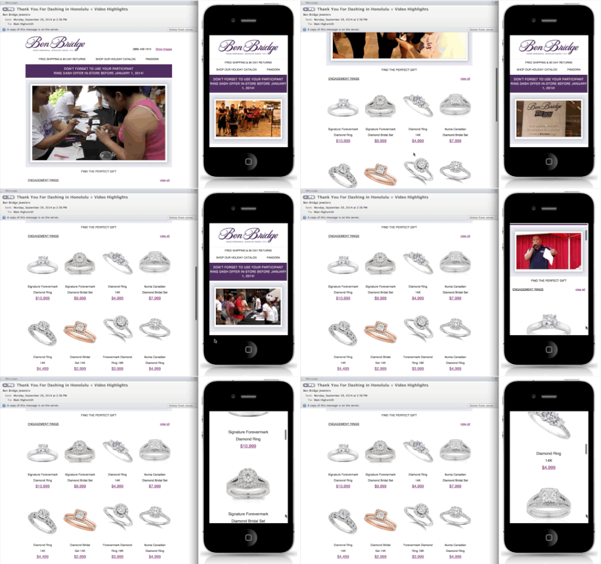
 With over 50% of today's emails being opened and viewed on mobile devices, it's critical to have your content automatically adapt and flourish in these environments. Doing so can increase click-through engagement by almost 40-50%. All of TailoredMail's templates and article-wizards are 'responsive', and adapt to the screen-size of the subscriber's device. TailoredMail will even convert your existing templates to a responsive design when you first sign up to use our service.
We also give you 100% HTML-to-HTML control over your templates and campaigns. Most email providers change or limit the HTML you can use. That's where TailoredMail shines - you can use our mobile-responsive template layouts, ask us to create or convert templates you already have, or enter your own HTML.

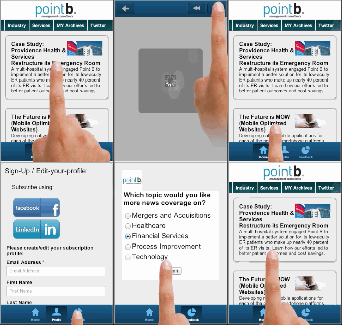
But, TailoredMail never passes up an opportunity to go even further to improve subscriber engagement. We have an industry-first/only offering where we can turn your email newsletters or campaigns into an instant mobile-app. It works on all smartphones, and requires NO app-store-downloads. This solution further increases your subscriber engagement rates by leveraging all the benefits of today's smartphone devices, and gives them ready-access .
Many email marketers are often unaware of how often their content is viewed on a mobile device or which specific devices are being used. However, TailoredMail comes with comprehensive mobile device reporting and tracking.
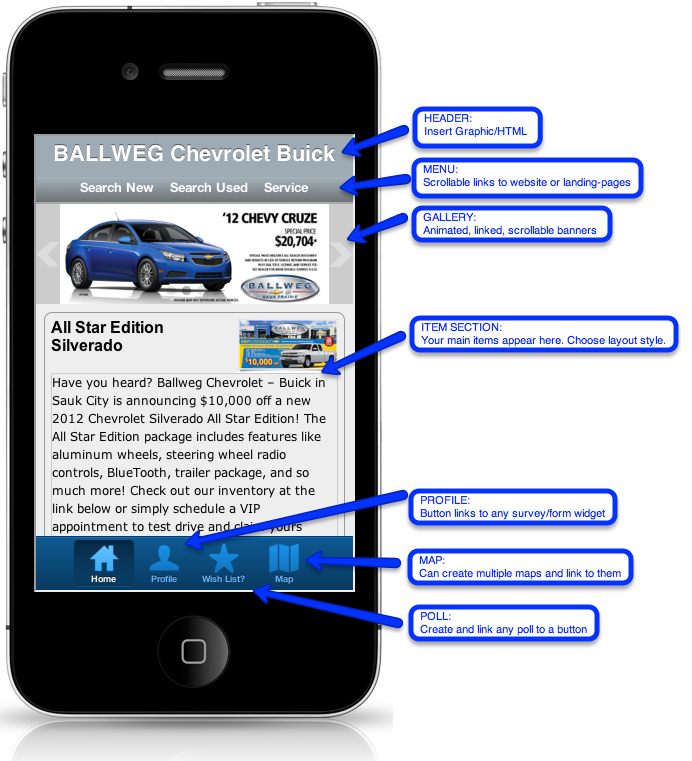
Below is an example of one of our clients landing-page 'apps':

